

BioNova Ediciones
BRANDING
Client: Bárbara Nova-Franco.
A translation, editing, and scientific consulting company that believes that all knowledge generated, both in the laboratory and in the field, should be published and applied for the benefit of humanity and the world.
Role
Brand Designer
Timeline
OCT - NOV 2024
Skills
Illustrator / Photoshop / Figma
Role
Brand Designer
Team
Solo
Timeline
OCT - NOV 2024
Skills
Illustrator, Photoshop, and Figma.


A translation, editing and scientific consulting company founded by Bárbara Nova-Franco, a biologist and PhD in Biomedical Sciences with honors (UAEM 2009, UNAM 2015, respectively).
BioNova Ediciones seeks to HELP, PROMOTE, and SUPPORT students, researchers and companies within Mexico so that, through translation and Scientific Coaching, the scientific knowledge generated is recognized, thus positioning Mexican female scientists internationally through language.
But mainly, create a safe place to talk about science and care for people's mental and physical health, supporting them professionally, emotionally and mentally to follow and achieve their goals.
The Challenge
Develop a visual brand identity and communication materials for BioNova Ediciones that conveys the company's philosophy, personality, and values.
The Process
After having a thorough conversation with Bárbara Nova-Franco, analyzing BioNova’s social media, brands she looks up to, and lots of writing, I defined the objective of this project, description of the company’s services, value proposition, target audience, and most importantly, its past, present, and future. This helped me trace the path of the brand.

Target audience
Doctorate students nearing completion, postdocs just starting out, or young researchers.

Generally 22-to-40 years-old women with a middle/Upper-middle (C/C+) – Upper (A/B) socioeconomic level in either Mexico City, Monterrey, or other Spanish-speaking countries.

These are generally women who are tired and fed up with being belittled, denied opportunities, and not receiving support from people in their field. They are honest, fair, understanding, compassionate, and flexible.
Meaning of the name
The owner and founder came up with the name and it’s the combination of:
This reflects the founder's commitment to supporting the science industry and individuals so they can continue helping the world.

Conceptualization
Supernova... why?
A supernova is an explosion that produces much of the material in the universe. It occurs at the end of a star's life, exploding and containing the essential elements for the universe and life.
The connection between this concept and the brand is

The previous star (traditional science) explodes due to the changes (brought about by BioNova Ediciones), leaving a mark that illuminates the universe. Its remnant elements create new knowledge, new attitudes, and a secure place in science, and its brilliance illuminates the path for women scientists in the universe. Supernovae also have spiritual meanings of guidance, transformation, change, and the end of one stage and the beginning of something new.
The logo and its meaning
The logo's typography was selected to provide a sense of stability and formality.
The icon incorporates elements that reference the molecules that constitute living beings. This relates to the concept of a supernova, as they contain the essential elements for the universe and life, generating molecules, and creating everything we know today. In the icon, the following elements represent parts BioNova Ediciones:

Typography
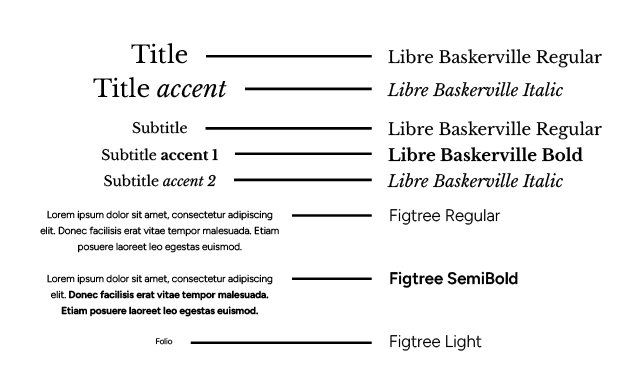
The primary typeface - Libre Baskerville: classic style with modern elements, adaptable to any era, friendliness yet formal feel, and stability.
The secondary typeface - Figtree: complements with its geometric, modern style. Excellent legibility.
Their combination conveys a sense of formality and professionalism alongside confidence and approachability.

Color Palette
This color palette is based on the colors of supernovae, as they provide their vibe and energy into the identity.
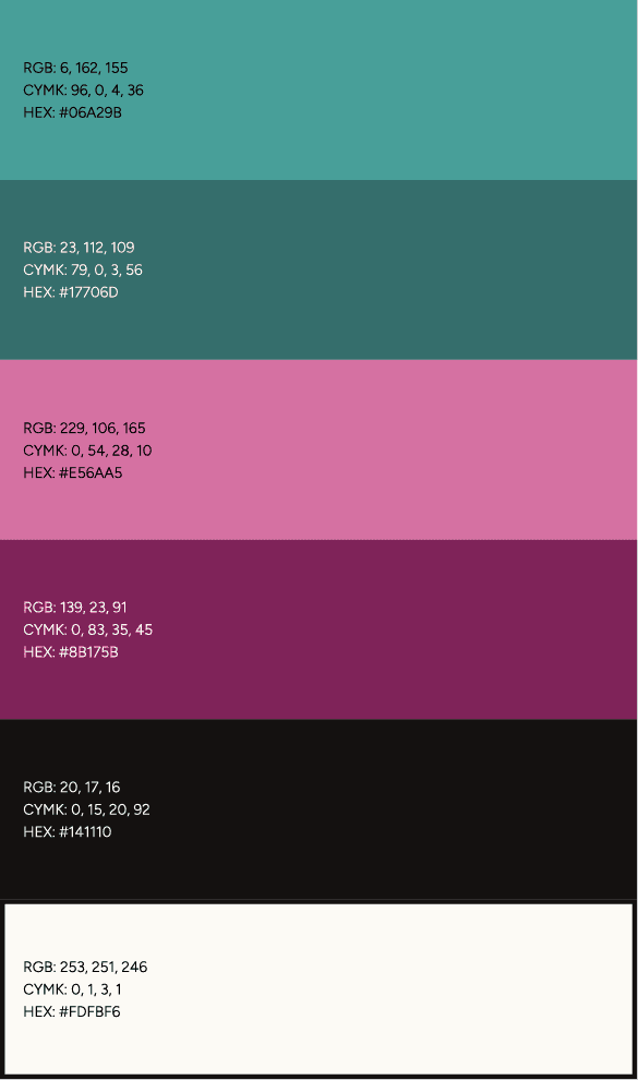
Blue-greens represent science and the knowledge generated.
Pinks represent the transformation that BioNova Ediciones seeks to bring to science.
White and black represent that we will be there for our clients in the light and in the darkness.
Graphic elements
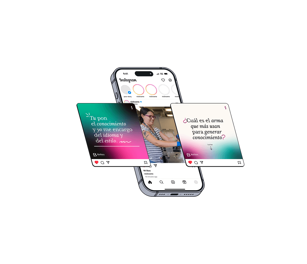
The gradients - Represent the light radiating from the BioNova Ediciones supernova, illuminating the path and guiding the researchers to achieve their goals.


The shapes and lines - Lends a more casual and dynamic feel to the brand, as they are "free-flowing" strokes.
The Result




Reflection
With this project, I learned a better conceptualizing and research process for the initial phase to have a more established design project throughout; gave me more tools to get to know clients and brands better, and was an excellent challenge to push my creativity and design skills.
BioNova Ediciones
BRANDING
Client: Bárbara Nova-Franco.
A translation, editing, and scientific consulting company that believes that all knowledge generated, both in the laboratory and in the field, should be published and applied for the benefit of humanity and the world.
Role
Brand Designer
Timeline
OCT - NOV 2024
Skills
Illustrator / Photoshop / Figma
A translation, editing and scientific consulting company founded by Bárbara Nova-Franco, a biologist and PhD in Biomedical Sciences with honors (UAEM 2009, UNAM 2015, respectively).
BioNova Ediciones seeks to HELP, PROMOTE, and SUPPORT students, researchers and companies within Mexico so that, through translation and Scientific Coaching, the scientific knowledge generated is recognized, thus positioning Mexican female scientists internationally through language.
But mainly, create a safe place to talk about science and care for people's mental and physical health, supporting them professionally, emotionally and mentally to follow and achieve their goals.
The Challenge
Develop a visual brand identity and communication materials for BioNova Ediciones that conveys the company's philosophy, personality, and values.
The Process
After having a thorough conversation with Bárbara Nova-Franco, analyzing BioNova’s social media, brands she looks up to, and lots of writing, I defined the objective of this project, description of the company’s services, value proposition, target audience, and most importantly, its past, present, and future. This helped me trace the path of the brand.
Target audience
Doctorate students nearing completion, postdocs just starting out, or young researchers.
Generally 22-to-40 years-old women with a middle/Upper-middle (C/C+) – Upper (A/B) socioeconomic level in either Mexico City, Monterrey, or other Spanish-speaking countries.
These are generally women who are tired and fed up with being belittled, denied opportunities, and not receiving support from people in their field. They are honest, fair, understanding, compassionate, and flexible.
Meaning of the name
The owner and founder came up with the name and it’s the combination of:
This reflects the founder's commitment to supporting the science industry and individuals so they can continue helping the world.
Conceptualization
Supernova... why? - A supernova is an explosion that produces much of the material in the universe. It occurs at the end of a star's life, exploding and containing the essential elements for the universe and life.
The connection between this concept and the brand is
The previous star (traditional science) explodes due to the changes (brought about by BioNova Ediciones), leaving a mark that illuminates the universe. Its remnant elements create new knowledge, new attitudes, and a secure place in science, and its brilliance illuminates the path for women scientists in the universe. Supernovae also have spiritual meanings of guidance, transformation, change, and the end of one stage and the beginning of something new.
The logo and its meaning
The logo's typography was selected to provide a sense of stability and formality.
The icon incorporates elements that reference the molecules that constitute living beings. This relates to the concept of a supernova, as they contain the essential elements for the universe and life, generating molecules, and creating everything we know today. In the icon, the following elements represent parts BioNova Ediciones:
Typography
The primary typeface - Libre Baskerville: classic style with modern elements, adaptable to any era, friendliness yet formal feel, and stability.
The secondary typeface - Figtree: complements with its geometric, modern style. Excellent legibility.
Their combination conveys a sense of formality and professionalism alongside confidence and approachability.
Color Palette
This color palette is based on the colors of supernovae, as they provide their vibe and energy into the identity.
Blue-greens represent science and the knowledge generated.
Pinks represent the transformation that BioNova Ediciones seeks to bring to science.
White and black represent that we will be there for our clients in the light and in the darkness.
Graphic elements
The gradients - Represent the light radiating from the BioNova Ediciones supernova, illuminating the path and guiding the researchers to achieve their goals.
The shapes and lines - Lends a more casual and dynamic feel to the brand, as they are "free-flowing" strokes.
The Result
Reflection
With this project, I learned a better conceptualizing and research process for the initial phase to have a more established design project throughout; gave me more tools to get to know clients and brands better, and was an excellent challenge to push my creativity and design skills.

BioNova Ediciones
BRANDING
Client: Bárbara Nova-Franco.
A translation, editing, and scientific consulting company that believes that all knowledge generated, both in the laboratory and in the field, should be published and applied for the benefit of humanity and the world.
Role
Brand Designer
Timeline
OCT - NOV 2024
Tools
Illustrator, Photoshop, and Figma.
A translation, editing and scientific consulting company founded by Bárbara Nova-Franco, a biologist and PhD in Biomedical Sciences with honors (UAEM 2009, UNAM 2015, respectively).
BioNova Ediciones seeks to HELP, PROMOTE, and SUPPORT students, researchers and companies within Mexico so that, through translation and Scientific Coaching, the scientific knowledge generated is recognized, thus positioning Mexican female scientists internationally through language.
But mainly, create a safe place to talk about science and care for people's mental and physical health, supporting them professionally, emotionally and mentally to follow and achieve their goals.
The Challenge
Develop a visual brand identity and communication materials for BioNova Ediciones that conveys the company's philosophy, personality, and values.
The Process
After having a thorough conversation with Bárbara Nova-Franco, analyzing BioNova’s social media, brands she looks up to, and lots of writing, I defined the objective of this project, description of the company’s services, value proposition, target audience, and most importantly, its past, present, and future. This helped me trace the path of the brand.
Target audience
Doctorate students nearing completion, postdocs just starting out, or young researchers.
Generally 22-to-40 years-old women with a middle/Upper-middle (C/C+) – Upper (A/B) socioeconomic level in either Mexico City, Monterrey, or other Spanish-speaking countries.
These are generally women who are tired and fed up with being belittled, denied opportunities, and not receiving support from people in their field. They are honest, fair, understanding, compassionate, and flexible.
Meaning of the name
The owner and founder came up with the name and it’s the combination, explained in the next image. This reflects the founder's commitment to supporting the science industry and individuals so they can continue helping the world.
Conceptualization
Supernova... why? - A supernova is an explosion that produces much of the material in the universe. It occurs at the end of a star's life, exploding and containing the essential elements for the universe and life.
The connection between this concept and the brand is:
The previous star (traditional science) explodes due to the changes (brought about by BioNova Ediciones), leaving a mark that illuminates the universe. Its remnant elements create new knowledge, new attitudes, and a secure place in science, and its brilliance illuminates the path for women scientists in the universe. Supernovae also have spiritual meanings of guidance, transformation, change, and the end of one stage and the beginning of something new.
The logo and its meaning
The logo's typography was selected to provide a sense of stability and formality.
The icon incorporates elements that reference the molecules that constitute living beings. This relates to the concept of a supernova, as they contain the essential elements for the universe and life, generating molecules, and creating everything we know today. In the icon, the following elements represent parts BioNova Ediciones:
Typography
The primary typeface - Libre Baskerville: classic style with modern elements, adaptable to any era, friendliness yet formal feel, and stability.
The secondary typeface - Figtree: complements with its geometric, modern style. Excellent legibility.
Their combination conveys a sense of formality and professionalism alongside confidence and approachability.
Color Palette
This color palette is based on the colors of supernovae, as they provide their vibe and energy into the identity.

Blue-greens represent science and the knowledge generated.
Pinks represent the transformation that BioNova Ediciones seeks to bring to science.
White and black represent that we will be there for our clients in the light and in the darkness.
Graphic elements
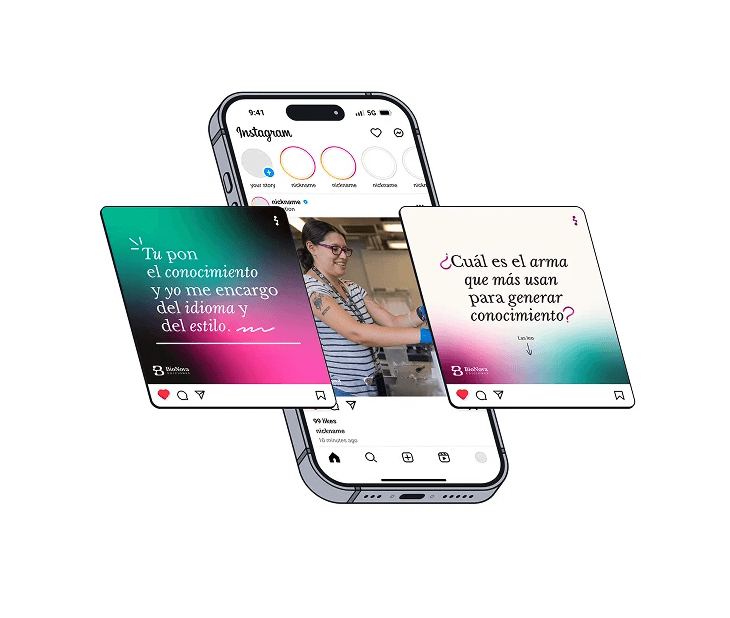
The gradients - Represent the light radiating from the BioNova Ediciones supernova, illuminating the path and guiding the researchers to achieve their goals.
The shapes and lines - Lends a more casual and dynamic feel to the brand, as they are "free-flowing" strokes.
The Result

Reflection
With this project, I learned a better conceptualizing and research process for the initial phase to have a more established design project throughout; gave me more tools to get to know clients and brands better, and was an excellent challenge to push my creativity and design skills.
BioNova Ediciones
BRANDING
Client: Bárbara Nova-Franco.
A translation, editing, and scientific consulting company that believes that all knowledge generated, both in the laboratory and in the field, should be published and applied for the benefit of humanity and the world.
Role
Brand Designer
Skills
Illustrator / Photoshop / Figma
Timeline
OCT - NOV 2024
A translation, editing and scientific consulting company founded by Bárbara Nova-Franco, a biologist and PhD in Biomedical Sciences with honors (UAEM 2009, UNAM 2015, respectively).
BioNova Ediciones seeks to HELP, PROMOTE, and SUPPORT students, researchers and companies within Mexico so that, through translation and Scientific Coaching, the scientific knowledge generated is recognized, thus positioning Mexican female scientists internationally through language.
But mainly, create a safe place to talk about science and care for people's mental and physical health, supporting them professionally, emotionally and mentally to follow and achieve their goals.
The Challenge
Develop a visual brand identity and communication materials for BioNova Ediciones that conveys the company's philosophy, personality, and values.
The Process
After having a thorough conversation with Bárbara Nova-Franco, analyzing BioNova’s social media, brands she looks up to, and lots of writing, I defined the objective of this project, description of the company’s services, value proposition, target audience, and most importantly, its past, present, and future. This helped me trace the path of the brand.
Target audience
Doctorate students nearing completion, postdocs just starting out, or young researchers.
Generally 22-to-40 years-old women with a middle/Upper-middle (C/C+) – Upper (A/B) socioeconomic level in either Mexico City, Monterrey, or other Spanish-speaking countries.
These are generally women who are tired and fed up with being belittled, denied opportunities, and not receiving support from people in their field. They are honest, fair, understanding, compassionate, and flexible.
Meaning of the name
The owner and founder came up with the name and it’s the combination of:
This reflects the founder's commitment to supporting the science industry and individuals so they can continue helping the world.
Conceptualization
Supernova... why? - A supernova is an explosion that produces much of the material in the universe. It occurs at the end of a star's life, exploding and containing the essential elements for the universe and life.
The connection between this concept and the brand is:
The previous star (traditional science) explodes due to the changes (brought about by BioNova Ediciones), leaving a mark that illuminates the universe. Its remnant elements create new knowledge, new attitudes, and a secure place in science, and its brilliance illuminates the path for women scientists in the universe. Supernovae also have spiritual meanings of guidance, transformation, change, and the end of one stage and the beginning of something new.
The logo and its meaning
The logo's typography was selected to provide a sense of stability and formality.
The icon incorporates elements that reference the molecules that constitute living beings. This relates to the concept of a supernova, as they contain the essential elements for the universe and life, generating molecules, and creating everything we know today. In the icon, the following elements represent parts BioNova Ediciones:
Typography
The primary typeface - Libre Baskerville: classic style with modern elements, adaptable to any era, friendliness yet formal feel, and stability.
The secondary typeface - Figtree: complements with its geometric, modern style. Excellent legibility.
Their combination conveys a sense of formality and professionalism alongside confidence and approachability.
Color Palette
This color palette is based on the colors of supernovae, as they provide their vibe and energy into the identity.
Blue-greens represent science and the knowledge generated.
Pinks represent the transformation that BioNova Ediciones seeks to bring to science.
White and black represent that we will be there for our clients in the light and in the darkness.
Graphic elements
The gradients - Represent the light radiating from the BioNova Ediciones supernova, illuminating the path and guiding the researchers to achieve their goals.
The shapes and lines - Lends a more casual and dynamic feel to the brand, as they are "free-flowing" strokes.
The Result
Reflection
With this project, I learned a better conceptualizing and research process for the initial phase to have a more established design project throughout; gave me more tools to get to know clients and brands better, and was an excellent challenge to push my creativity and design skills.
