
Aural Estudio
BRANDING
Client: Fernanda Luzanilla and Tanya Rojas.
A female founded and owned sound design studio in Hermosillo Sonora that offers professional audio services and provides a space where learning, art, and technology converge.
Role
Brand Designer
Timeline
MAR 2025 - PRESENT
Skills
Adobe Suite / Figma


Aural Estudio offers professional audio services, creating unforgettable experiences through music production, audio post-production for film, and workshops in acoustics and audio, they provide a space where learning, art, and technology converge—a place where we tell stories and create high-quality projects that evoke emotions.
Aural Estudio wants to promote audio culture in Hermosillo, encouraging people to learn about, discover, and become interested in audio and its art, and for studios and production companies to give it the recognition it deserves and respect the work of audio professionals.
The Challenge
Creating a visual identity that reflected: the shared interest of the founders and owners in audio, spirituality, and their love for their hometown of Hermosillo.
The Process
After having a thorough analysis of brands they look up to and like, having constant conversations with the owners, and many other things, I had a better vision of the meaning, look and feel of the brand.

Target audience

Mostly young producers, directors, filmmakers, game developers, studios or independents.
People who are 15-to-35 years-old with a middle/Upper-middle (C/C+) or upper (A/B) socioeconomic level in the Northwest of Mexico.

Young people interested in education, technology, and experimentation.
They are generally people who love audiovisual content, are proactive, creative, ambitious, responsible, kind, curious, generous, friendly, open, and loyal.
Meaning of the name
The owners and founders came up with the name: “Aural” means auditory, related to the ear, or pertaining to hearing. It was also chosen because it is a homonym/homophone of the word “aura,” which means: “A spiritual atmosphere that emanates from someone or something and surrounds it. A luminous radiation that surrounds living beings or objects, only perceptible to individuals with special sensitivity. etc.”
This word to name the studio because we believe it encompasses two important characteristics that unite the owners: sound and spirituality.

Conceptualization
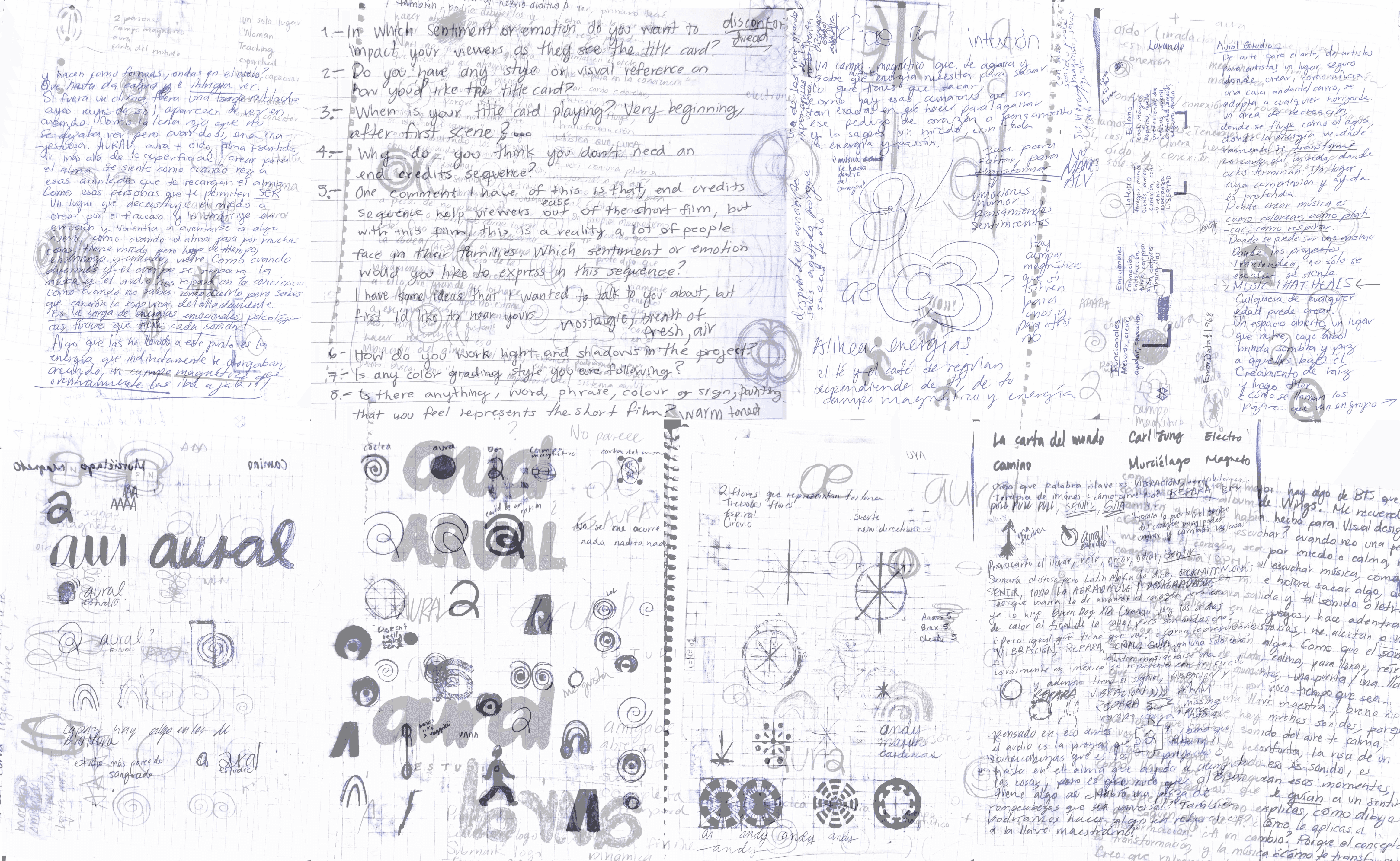
To create the concept, I identified the brand in many ways: by asking the owners its internal and external meaning, functional and emotional atributes that conect through key words; conceptual and sensorial analogies; writing, listening to music, sketching, merging concepts, that eventually came up with...

TRANSFORMATION - Just as ideas, music and audio can transform people emotionally, mentally, and physically, guiding them in a new direction, encouraging them to take action and be part of meaningful change.
This is reflected in the visuals: a variety of typography, graphic elements, and colors, all used in a balanced and seemingly random way. This identity aims for a minimalist yet strong aesthetic, employing neutral and vibrant colors to showcase versatility and adaptability. It seeks to express dynamism and fun, captivating the viewer and holding their interest.
A Link Between the Möbius Strip, Sound, and the Tarot's Wheel of Fortune
The owners and founders came up with the name: “Aural” means auditory, related to the ear, or pertaining to hearing. It was also chosen because it is a homonym/homophone of the word “aura,” which means: “A spiritual atmosphere that emanates from someone or something and surrounds it. A luminous radiation that surrounds living beings or objects, only perceptible to individuals with special sensitivity. etc.”
This word to name the studio because we believe it encompasses two important characteristics that unite the owners: sound and spirituality.


Selecting the perfect typography
The search for a magnetic combination was long but determined.
Final selection
The main typeface - Widescreen: used only in the logo with modifications, to create the desired magnetic effect.
These combinations of typefaces are meant to give a timeless and concrete style, maintaining flexibility between curved and straight lines that make it smooth yet sharp, stable, legible.
One that gives contrast and distortion to the stability of the typefaces, creating dynamism through its style that imitates an ink bleed.


Selecting the perfect color palette
As we were discussing how to represent Sonora throughout the brand, we decided to showcase it through colors, specifically the colors of the sunset in Hermosillo, Sonora.
Final selection

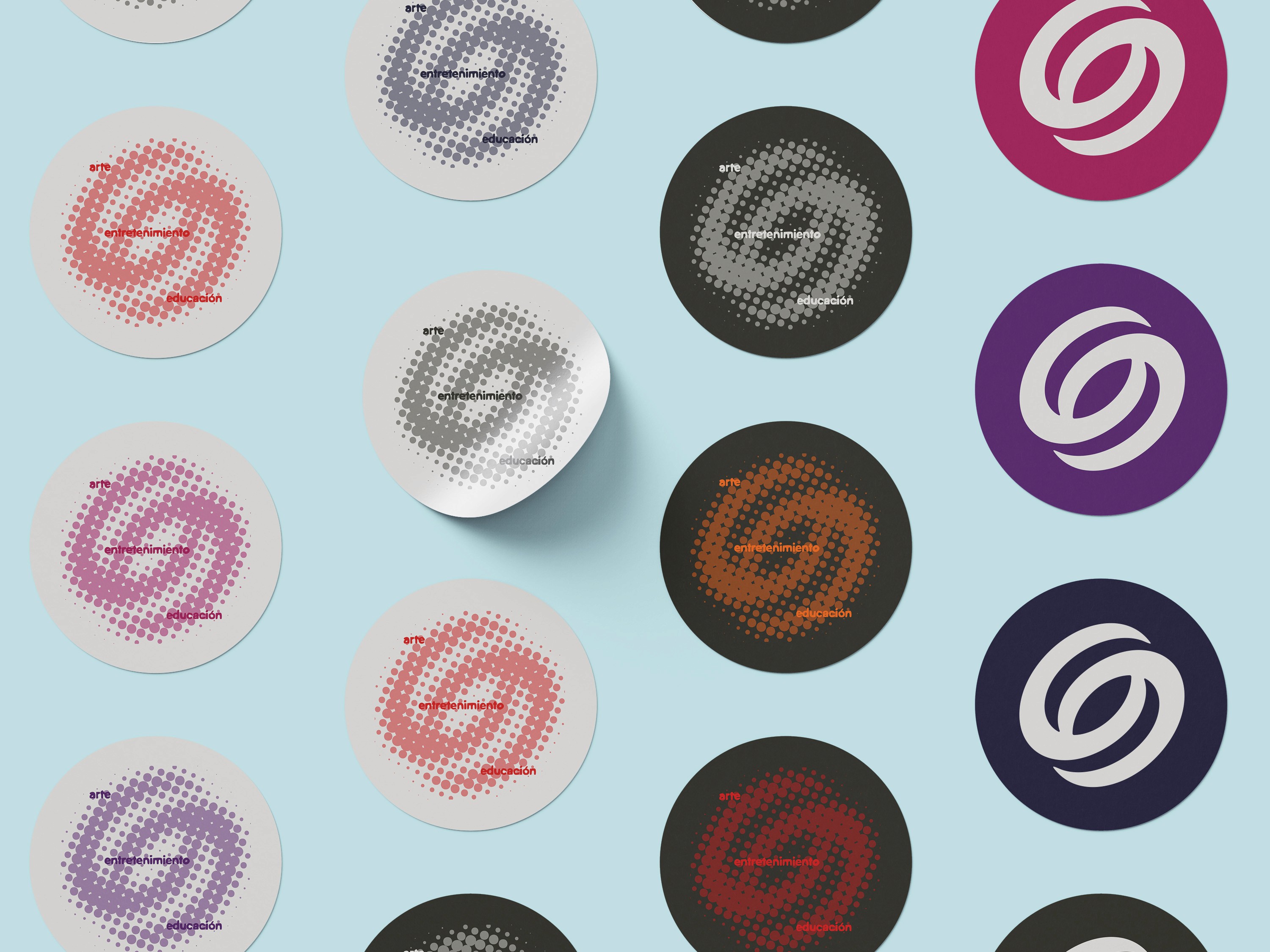
From inkbleed to halftone and viceversa: visualizes the feeling of magnetism.

The Result


Reflection
A project I look fondly, this project put me through so much but also gave me so much more. The process of developing this branding made me explore routes I stopped reaching to, making me appreciate more how the little things do paint the bigger picture: how even listening to your favorite music, writing every thought in your mind, and reading about a new topic (tarot) can enrich a project and boost it to its full potential.

Aural Estudio
BRANDING
Client: Fernanda Luzanilla and Tanya Rojas.
A female founded and owned sound design studio in Hermosillo Sonora that offers professional audio services and provides a space where learning, art, and technology converge.
Role
Brand Designer
Timeline
MAR 2025 - PRESENT
Skills
Adobe Suite / Figma
Aural Estudio offers professional audio services, creating unforgettable experiences through music production, audio post-production for film, and workshops in acoustics and audio, they provide a space where learning, art, and technology converge—a place where we tell stories and create high-quality projects that evoke emotions.
Aural Estudio wants to promote audio culture in Hermosillo, encouraging people to learn about, discover, and become interested in audio and its art, and for studios and production companies to give it the recognition it deserves and respect the work of audio professionals.
The Challenge
Creating a visual identity that reflected: the shared interest of the founders and owners in audio, spirituality, and their love for their hometown of Hermosillo.
The Process
After having a thorough analysis of brands they look up to and like, having constant conversations with the owners, and many other things, I had a better vision of the meaning, look and feel of the brand.
Target audience
Mostly young producers, directors, filmmakers, game developers, studios or independents.
People who are 15-to-35 years-old with a middle/Upper-middle (C/C+) or upper (A/B) socioeconomic level in the Northwest of Mexico.
Young people interested in education, technology, and experimentation.
They are generally people who love audiovisual content, are proactive, creative, ambitious, responsible, kind, curious, generous, friendly, open, and loyal.
Meaning of the name
The owners and founders came up with the name: “Aural” means auditory, related to the ear, or pertaining to hearing. It was also chosen because it is a homonym/homophone of the word “aura,” which means: “A spiritual atmosphere that emanates from someone or something and surrounds it. A luminous radiation that surrounds living beings or objects, only perceptible to individuals with special sensitivity. etc.”
This word to name the studio because we believe it encompasses two important characteristics that unite the owners: sound and spirituality.
Conceptualization
To create the concept, I identified the brand in many ways: by asking the owners its internal and external meaning, functional and emotional atributes that conect through key words; conceptual and sensorial analogies; writing, listening to music, sketching, merging concepts, that eventually came up with...
TRANSFORMATION - Just as ideas, music and audio can transform people emotionally, mentally, and physically, guiding them in a new direction, encouraging them to take action and be part of meaningful change.
This is reflected in the visuals: a variety of typography, graphic elements, and colors, all used in a balanced and seemingly random way. This identity aims for a minimalist yet strong aesthetic, employing neutral and vibrant colors to showcase versatility and adaptability. It seeks to express dynamism and fun, captivating the viewer and holding their interest.
A Link Between the Möbius Strip, Sound, and the Tarot's Wheel of Fortune
The owners and founders came up with the name: “Aural” means auditory, related to the ear, or pertaining to hearing. It was also chosen because it is a homonym/homophone of the word “aura,” which means: “A spiritual atmosphere that emanates from someone or something and surrounds it. A luminous radiation that surrounds living beings or objects, only perceptible to individuals with special sensitivity. etc.”
This word to name the studio because we believe it encompasses two important characteristics that unite the owners: sound and spirituality.
Selecting the perfect typography
The search for a magnetic combination was long but determined.
Final selection
The main typeface - Widescreen: used only in the logo with modifications, to create the desired magnetic effect.
These combinations of typefaces are meant to give a timeless and concrete style, maintaining flexibility between curved and straight lines that make it smooth yet sharp, stable, legible.
One that gives contrast and distortion to the stability of the typefaces, creating dynamism through its style that imitates an ink bleed.
Selecting the perfect color palette
As we were discussing how to represent Sonora throughout the brand, we decided to showcase it through colors, specifically the colors of the sunset in Hermosillo, Sonora.
Final selection
From inkbleed to halftone and viceversa: visualizes the feeling of magnetism.
The Result
A project I look fondly, this project put me through so much but also gave me so much more. The process of developing this branding made me explore routes I stopped reaching to, making me appreciate more how the little things do paint the bigger picture: how even listening to your favorite music, writing every thought in your mind, and reading about a new topic (tarot) can enrich a project and boost it to its full potential.
Reflection
Aural Estudio
BRANDING
Client: Fernanda Luzanilla and Tanya Rojas.
A female founded and owned sound design studio in Hermosillo Sonora that offers professional audio services and provides a space where learning, art, and technology converge.
Role
Brand Designer
Timeline
MAR 2025 - PRESENT
Tools
Adobe Suite / Figma
Aural Estudio offers professional audio services, creating unforgettable experiences through music production, audio post-production for film, and workshops in acoustics and audio, they provide a space where learning, art, and technology converge—a place where we tell stories and create high-quality projects that evoke emotions.
Aural Estudio wants to promote audio culture in Hermosillo, encouraging people to learn about, discover, and become interested in audio and its art, and for studios and production companies to give it the recognition it deserves and respect the work of audio professionals.
The Challenge
Creating a visual identity that reflected: the shared interest of the founders and owners in audio, spirituality, and their love for their hometown of Hermosillo.
The Process
After having a thorough analysis of brands they look up to and like, having constant conversations with the owners, and many other things, I had a better vision of the meaning, look and feel of the brand.
Target audience

Mostly young producers, directors, filmmakers, game developers, studios or independents.
People who are 15-to-35 years-old with a middle/Upper-middle (C/C+) or upper (A/B) socioeconomic level in the Northwest of Mexico.

Young people interested in education, technology, and experimentation.
They are generally people who love audiovisual content, are proactive, creative, ambitious, responsible, kind, curious, generous, friendly, open, and loyal.
Meaning of the name
The owners and founders came up with the name: “Aural” means auditory, related to the ear, or pertaining to hearing. It was also chosen because it is a homonym/homophone of the word “aura,” which means: “A spiritual atmosphere that emanates from someone or something and surrounds it. A luminous radiation that surrounds living beings or objects, only perceptible to individuals with special sensitivity. etc.”
This word to name the studio because we believe it encompasses two important characteristics that unite the owners: sound and spirituality.
Conceptualization
To create the concept, I identified the brand in many ways: by asking the owners its internal and external meaning, functional and emotional atributes that conect through key words; conceptual and sensorial analogies; writing, listening to music, sketching, merging concepts, that eventually came up with...
TRANSFORMATION - Just as ideas, music and audio can transform people emotionally, mentally, and physically, guiding them in a new direction, encouraging them to take action and be part of meaningful change.
This is reflected in the visuals: a variety of typography, graphic elements, and colors, all used in a balanced and seemingly random way. This identity aims for a minimalist yet strong aesthetic, employing neutral and vibrant colors to showcase versatility and adaptability. It seeks to express dynamism and fun, captivating the viewer and holding their interest.
A Link Between the Möbius Strip, Sound, and the Tarot's Wheel of Fortune
The owners and founders came up with the name: “Aural” means auditory, related to the ear, or pertaining to hearing. It was also chosen because it is a homonym/homophone of the word “aura,” which means: “A spiritual atmosphere that emanates from someone or something and surrounds it. A luminous radiation that surrounds living beings or objects, only perceptible to individuals with special sensitivity. etc.”
This word to name the studio because we believe it encompasses two important characteristics that unite the owners: sound and spirituality.
Selecting the perfect typography
The search for a magnetic combination was long but determined.
Final selection
The main typeface - Widescreen: used only in the logo with modifications, to create the desired magnetic effect.
These combinations of typefaces are meant to give a timeless and concrete style, maintaining flexibility between curved and straight lines that make it smooth yet sharp, stable, legible.
One that gives contrast and distortion to the stability of the typefaces, creating dynamism through its style that imitates an ink bleed.
Selecting the perfect color palette
As we were discussing how to represent Sonora throughout the brand, we decided to showcase it through colors, specifically the colors of the sunset in Hermosillo, Sonora.
Final selection

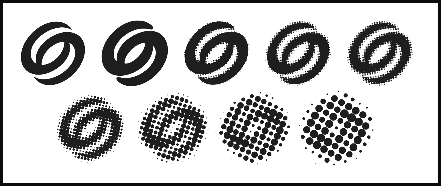
From inkbleed to halftone and viceversa: visualizes the feeling of magnetism.
The Result
Reflection
A project I look fondly, this project put me through so much but also gave me so much more. The process of developing this branding made me explore routes I stopped reaching to, making me appreciate more how the little things do paint the bigger picture: how even listening to your favorite music, writing every thought in your mind, and reading about a new topic (tarot) can enrich a project and boost it to its full potential.
Aural Estudio
BRANDING
Client: Fernanda Luzanilla and Tanya Rojas.
A female founded and owned sound design studio in Hermosillo Sonora that offers professional audio services and provides a space where learning, art, and technology converge.
Role
Brand Designer
Skills
Adobe Suite / Figma
Timeline
MAR 2025 - PRESENT
Aural Estudio offers professional audio services, creating unforgettable experiences through music production, audio post-production for film, and workshops in acoustics and audio, they provide a space where learning, art, and technology converge—a place where we tell stories and create high-quality projects that evoke emotions.
Aural Estudio wants to promote audio culture in Hermosillo, encouraging people to learn about, discover, and become interested in audio and its art, and for studios and production companies to give it the recognition it deserves and respect the work of audio professionals.
The Challenge
Creating a visual identity that reflected: the shared interest of the founders and owners in audio, spirituality, and their love for their hometown of Hermosillo.
The Process
After having a thorough analysis of brands they look up to and like, having constant conversations with the owners, and many other things, I had a better vision of the meaning, look and feel of the brand.
Target audience
Mostly young producers, directors, filmmakers, game developers, studios or independents.
People who are 15-to-35 years-old with a middle/Upper-middle (C/C+) or upper (A/B) socioeconomic level in the Northwest of Mexico.
Young people interested in education, technology, and experimentation.
They are generally people who love audiovisual content, are proactive, creative, ambitious, responsible, kind, curious, generous, friendly, open, and loyal.
Meaning of the name
The owners and founders came up with the name: “Aural” means auditory, related to the ear, or pertaining to hearing. It was also chosen because it is a homonym/homophone of the word “aura,” which means: “A spiritual atmosphere that emanates from someone or something and surrounds it. A luminous radiation that surrounds living beings or objects, only perceptible to individuals with special sensitivity. etc.”
This word to name the studio because we believe it encompasses two important characteristics that unite the owners: sound and spirituality.
Conceptualization
To create the concept, I identified the brand in many ways: by asking the owners its internal and external meaning, functional and emotional atributes that conect through key words; conceptual and sensorial analogies; writing, listening to music, sketching, merging concepts, that eventually came up with...
TRANSFORMATION - Just as ideas, music and audio can transform people emotionally, mentally, and physically, guiding them in a new direction, encouraging them to take action and be part of meaningful change.
This is reflected in the visuals: a variety of typography, graphic elements, and colors, all used in a balanced and seemingly random way. This identity aims for a minimalist yet strong aesthetic, employing neutral and vibrant colors to showcase versatility and adaptability. It seeks to express dynamism and fun, captivating the viewer and holding their interest.
A Link Between the Möbius Strip, Sound, and the Tarot's Wheel of Fortune
The owners and founders came up with the name: “Aural” means auditory, related to the ear, or pertaining to hearing. It was also chosen because it is a homonym/homophone of the word “aura,” which means: “A spiritual atmosphere that emanates from someone or something and surrounds it. A luminous radiation that surrounds living beings or objects, only perceptible to individuals with special sensitivity. etc.”
This word to name the studio because we believe it encompasses two important characteristics that unite the owners: sound and spirituality.
Selecting the perfect typography
The search for a magnetic combination was long but determined.
Final selection
The main typeface - Widescreen: used only in the logo with modifications, to create the desired magnetic effect.
These combinations of typefaces are meant to give a timeless and concrete style, maintaining flexibility between curved and straight lines that make it smooth yet sharp, stable, legible.
One that gives contrast and distortion to the stability of the typefaces, creating dynamism through its style that imitates an ink bleed.
Selecting the perfect color palette
As we were discussing how to represent Sonora throughout the brand, we decided to showcase it through colors, specifically the colors of the sunset in Hermosillo, Sonora.
Final selection
From inkbleed to halftone and viceversa: visualizes the feeling of magnetism.
The Result
Reflection
A project I look fondly, this project put me through so much but also gave me so much more. The process of developing this branding made me explore routes I stopped reaching to, making me appreciate more how the little things do paint the bigger picture: how even listening to your favorite music, writing every thought in your mind, and reading about a new topic (tarot) can enrich a project and boost it to its full potential.
